|
|
Post by Zamoraaaah on Aug 5, 2011 20:24:45 GMT
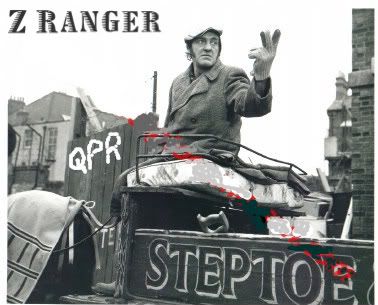
Exactly as Lonegunmen described all that time ago. www.premierleague.com/staticFiles/4b/8a/0,,12306~166475,00.pdf [Macmoish: Pages 38-39) Macmoish Edit:Juzzie on LFW posted the photos. Hopefully OK, I'll repost them here  |
|
|
|
Post by londonranger on Aug 5, 2011 20:30:12 GMT
Thanks Zed. Red and white checks is better. Wonder how much the charge.
|
|
|
|
Post by gibraltar on Aug 5, 2011 20:50:02 GMT
hmmm... the 3rd kit is prob the best.
(or last seasons green kit, lol)
|
|
|
|
Post by RoryTheRanger on Aug 5, 2011 20:51:20 GMT
Needs thicker hoops on the home, will wait to see how the away looks in real life before I judge.
|
|
|
|
Post by Jo-Onenil on Aug 5, 2011 21:30:18 GMT
So our sponsor is TBC? I'll google it...
|
|
|
|
Post by Jo-Onenil on Aug 5, 2011 21:34:24 GMT
I'm a bloody fool! Didnt realised it means To Be Confirmed...
|
|
|
|
Post by londonranger on Aug 5, 2011 21:36:46 GMT
Not Pirelli?
|
|
|
|
Post by Jo-Onenil on Aug 5, 2011 21:59:35 GMT
Nothing official yet
|
|
|
|
Post by eusebio13 on Aug 5, 2011 22:06:21 GMT
good find Mr Z
|
|
Doudou
Dave Mangnall
 The Four Year Plan
Posts: 222 
|
Post by Doudou on Aug 5, 2011 22:09:07 GMT
I hate this Orange 2nd kit and I am used to it being Dutch and all!
|
|
|
|
Post by londonranger on Aug 5, 2011 22:10:47 GMT
What is this obsession with orange. Maybe he lies orange donuts.
|
|
|
|
Post by londonranger on Aug 5, 2011 22:29:01 GMT
|
|
|
|
Post by Bushman on Aug 5, 2011 22:30:55 GMT
I'm a bloody fool! Didnt realised it means To Be Confirmed...  
|
|
dsqpr
Ian Holloway

Posts: 350
|
Post by dsqpr on Aug 5, 2011 23:29:01 GMT
Sigh...
|
|
|
|
Post by Macmoish on Aug 5, 2011 23:36:06 GMT
Red and black hoops would have been mine
(But if I was choosing another colour than red, white, blue or black, I'd have gone for Wolves Gold)
|
|
|
|
Post by sharky on Aug 6, 2011 1:13:43 GMT
Like our hoops. Like the others not sure about the orange (did they need orange to get DJ?!), and like the third red and white.
|
|
|
|
Post by hoopsididitagain on Aug 6, 2011 3:14:44 GMT
dislike. Hoops are too thin and numerous, reminds me of our horrible JD sports sponsored effort back in League 2(?). How difficult can it be to make a blue and white hooped shirt. And what is all the nonsense on the shoulders of the other two? Poor show. Maybe they will look better in the flesh?
|
|
|
|
Post by Macmoish on Aug 6, 2011 7:36:13 GMT
Juzzie on LFW posted the photos. Hopefully OK, I'll repost them here |
|
|
|
Post by canadaranger on Aug 6, 2011 8:16:56 GMT
The end of Dennis the Menace then too...
|
|
|
|
Post by kempton ranger on Aug 6, 2011 8:19:31 GMT
Disagree.
Going by these drawings I prefer the away kit to the 3rd kit personally.
The away kit looks smart , whereas the 3rd kit I am still getting used too.
|
|
|
|
Post by Macmoish on Aug 6, 2011 8:24:13 GMT
|
|
|
|
Post by RoryTheRanger on Aug 6, 2011 8:50:45 GMT
I agree with you Mac, red and black hoops are the way forward!!! Our away kit from the 09/10 season was one of my favourites.
|
|
|
|
Post by kempton ranger on Aug 6, 2011 8:57:53 GMT
This would be an interesting choice as it looks very much like AC Milan kit and if we were likely to get Inter Milan sponsor , that would have an Italian feel about it? |
|
|
|
Post by gramps on Aug 6, 2011 9:34:43 GMT
I have already gone on record elsewhere as saying that I don't like the third strip. Sorry but I don't like the away strip either. Home looks as though there are more, narrower hoops but I can live with that - QPR are 'hoops'. In my view we should stick to hoops for all three. Green and white were fine and I really liked the red and black. What's wrong with having those three and sticking with them permanently .......................... oh yeah, of course, it's once again all about MONEY!
|
|
|
|
Post by kewgreen on Aug 6, 2011 9:59:45 GMT
The last time I remember the Rs wearing orange was at a one off match against the Sc*m.
I cant remember the season, but we were having a crap one, we'd decided to change our shirts for a reported change of luck to an all orange kit and we got well and truely hammered by them, never to wear the kit again.
I stood with my son on the condemed embankment end, and from the way we played we were the condemed ones.
When I now see those orange shirts I'm always going to be reminded of that game, scrap them, burn them.
|
|
|
|
Post by Macmoish on Aug 6, 2011 10:18:42 GMT
And just to spite the QPR messageboard posters and bloggers, Flavio woke up Gianni at four o'clock this morning and told him "Shred the shirts. We're not having some 20 pound (or less!) fans announcing before I'm ready, what the shirts are. We'll prove them wrong. Even if it costs us! "   |
|
|
|
Post by londonranger on Aug 6, 2011 13:39:30 GMT
That red and black is a Brazil teams home strip. Flamingo, very popullar team.
Im glad we go rid of the blue and white hooped socks.
Generally Im satisfied,
|
|
bowles
Dave Sexton
Posts: 1,939
|
Post by bowles on Aug 6, 2011 13:59:16 GMT
MMMMMM orange no thank you , quite like the red and whie quarters and the home shirt has five blue bands the same as the replica 60,s one i bought last season, also the hoops are narrow on both the new and old shirt , so not so bad after all!
|
|
|
|
Post by Lonegunmen on Aug 6, 2011 18:48:08 GMT
Just a reminder of who described these two months ago.....  |
|
|
|
Post by Macmoish on Aug 6, 2011 19:17:18 GMT
Just a reminder of who described these two months ago..... Yes! Was actually trying to find a link ... |
|