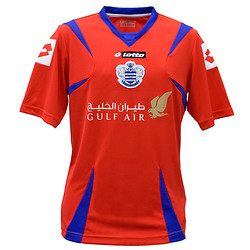
Post by QPR Report on Jun 24, 2009 8:02:29 GMT
When Saturday Comes - Newcastle Utd's yellow streak
Tuesday 23 June ~

As if Newcastle fans haven't suffered enough. A new humiliation was inflicted upon yesterday them with the launch of their away kit. It's a striped shirt in what is officially described as orange and yellow but is more plausibly custard and cream with yellow shorts. If the idea is to make the players look distinctive it will certainly do the trick.
Newcastle were once style pioneers in this area. In the 1970s, when most clubs had only one change strip, which they tended to keep for several years, Newcastle instigated the use of the Brazil national kit with yellow shirts, light blue shorts and white socks which was later copied by other clubs, notably Crystal Palace. They were also one of the first clubs to use grey (officially "silver") in an away strip back in 1983. But even if they storm through the Championship clinching promotion with months to spare it's highly unlikely that the custard and cream ensemble will be copied by other teams.
Some teams have won major trophies while wearing sartorial disasters, perhaps the most glaring example being Holland's Euro 88 winning shirts. These are now highly collectable because they were only worn for the tournament and never manufactured as a replica strip. Norwich fans might retain happy memories of the green and yellow flecked shirts in which they knocked Bayern Munich out of the UEFA Cup in 1993.
Equally, however, a bad season can seem all the worse when a team is wearing a badly designed shirt. Huddersfield's 10-1 defeat to Manchester City in their Division Two relegation season of 1987-88 – the most recent time that double figures have been conceded in a League game – was made all the more humiliating by the fact that they were kitted out in yellow and black checked shirts that looked children’s pyjamas. Similarly Hull City's tiger stripe shirts of the early 1990s, by general consensus one of the worst ever home kits, were first worn in a traumatic season, 1992-93, in which they finished one place above the relegation area in Division Three.
You would assume that the designers employed by sportswear agencies – Adidas in Newcastle's case – would know a lot about colour theory including which shades don't work well together. But the drive to be different overrides all such considerations. Ultimately, however, the decision in what to wear rests with the clubs – even though they will have a contract with a specific sportswear firm they don't have to accept a specific design that is offered to them. So you wonder whether Mike Ashley's eccentric staffing policy at the club has included putting a colourblind person in charge of merchandising.
And readers comments
www.wsc.co.uk/content/view/3552/38/
Tuesday 23 June ~

As if Newcastle fans haven't suffered enough. A new humiliation was inflicted upon yesterday them with the launch of their away kit. It's a striped shirt in what is officially described as orange and yellow but is more plausibly custard and cream with yellow shorts. If the idea is to make the players look distinctive it will certainly do the trick.
Newcastle were once style pioneers in this area. In the 1970s, when most clubs had only one change strip, which they tended to keep for several years, Newcastle instigated the use of the Brazil national kit with yellow shirts, light blue shorts and white socks which was later copied by other clubs, notably Crystal Palace. They were also one of the first clubs to use grey (officially "silver") in an away strip back in 1983. But even if they storm through the Championship clinching promotion with months to spare it's highly unlikely that the custard and cream ensemble will be copied by other teams.
Some teams have won major trophies while wearing sartorial disasters, perhaps the most glaring example being Holland's Euro 88 winning shirts. These are now highly collectable because they were only worn for the tournament and never manufactured as a replica strip. Norwich fans might retain happy memories of the green and yellow flecked shirts in which they knocked Bayern Munich out of the UEFA Cup in 1993.
Equally, however, a bad season can seem all the worse when a team is wearing a badly designed shirt. Huddersfield's 10-1 defeat to Manchester City in their Division Two relegation season of 1987-88 – the most recent time that double figures have been conceded in a League game – was made all the more humiliating by the fact that they were kitted out in yellow and black checked shirts that looked children’s pyjamas. Similarly Hull City's tiger stripe shirts of the early 1990s, by general consensus one of the worst ever home kits, were first worn in a traumatic season, 1992-93, in which they finished one place above the relegation area in Division Three.
You would assume that the designers employed by sportswear agencies – Adidas in Newcastle's case – would know a lot about colour theory including which shades don't work well together. But the drive to be different overrides all such considerations. Ultimately, however, the decision in what to wear rests with the clubs – even though they will have a contract with a specific sportswear firm they don't have to accept a specific design that is offered to them. So you wonder whether Mike Ashley's eccentric staffing policy at the club has included putting a colourblind person in charge of merchandising.
And readers comments
www.wsc.co.uk/content/view/3552/38/


